Site information page
Use this space to clarify what this page is about and who it is for.
This is an important page where your user will retrieve the information they are looking for - let them know they are in the right place!
Take a look below for examples of the different components you can choose for the body of your page. When you are adding a component, anything with a red asterisk is essential to complete and the system will not let you save without it.
This is the heading of an accordion. The heading is not required should you not need one.
This is the text inside an accordion.
Inside an accordion item, you can format the text:
- With bullet points
- Like this
- Or numbered lists
- Like this
You can also make text bold, italic or underlined. And add links.


Use this summary to highlight why a user should take an action. You can add an image to the component which looks great, although it works without one.
This is the summary for a 'small call to action'. Unlike the CTA above, this one is simpler and is good for things like linking to Facebook.

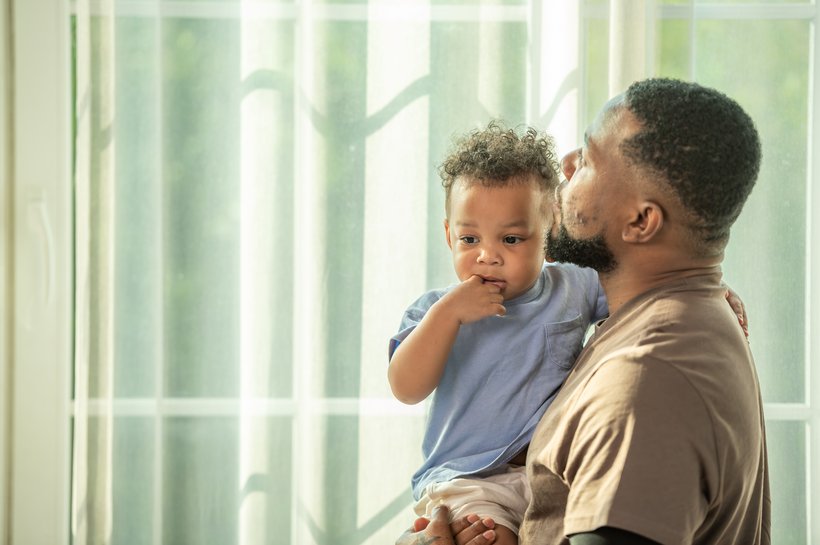
You don't have to add a caption to an image, but if you do it appears here. Make sure you have given your image a descriptive name that can be read by screen readers for those with visual impairments.

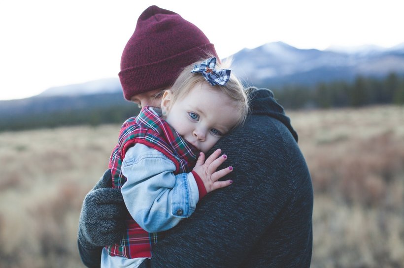
You don't have to add a caption to an image, but if you do it appears here.
About this component
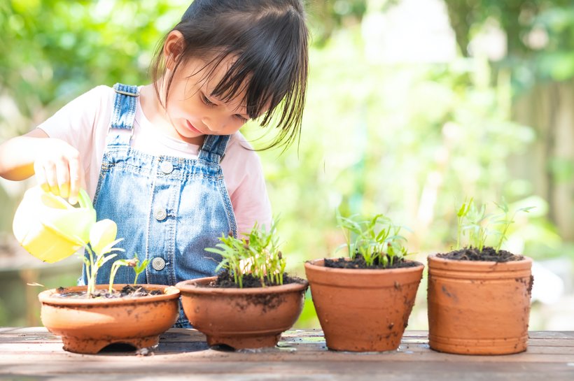
- In the small image with text, you can choose to align the image on the left or the right of the page.
- Be careful with the size and shape of the image, if it is too small Wagtail won't be able to create the neat, rounded corners. This image is 1600x1200 pixels.
- On a mobile, the text appears below the image.
This is the title of an image gallery


And here is a paragraph.
If your headings are not organised correctly, you will see an icon pop up in the 'checks' section in the top right corner of your screen, denoted by a pair of glasses. Make sure your headings sorted from largest to smallest.

